I created this design through my graphic design internship at Clemson Libraries. The client for this work was
R.M. Cooper Library’s Learning Commons, which was looking for a new setup for the floor. This meant they
needed markers for the different zones that they were setting up, which I was granted the opportunity to
work on. The hardest part of this project was learning to work with a branding palette and still creating
something that stood out. To help with this requirement, I chose to use organic shapes which are not
typically seen in Clemson University’s branding, and I used variations of the colors already in the branding
palette so that the banners stood out and still abided by the mandatory guidelines as part of an organization
affiliated with Clemson University.
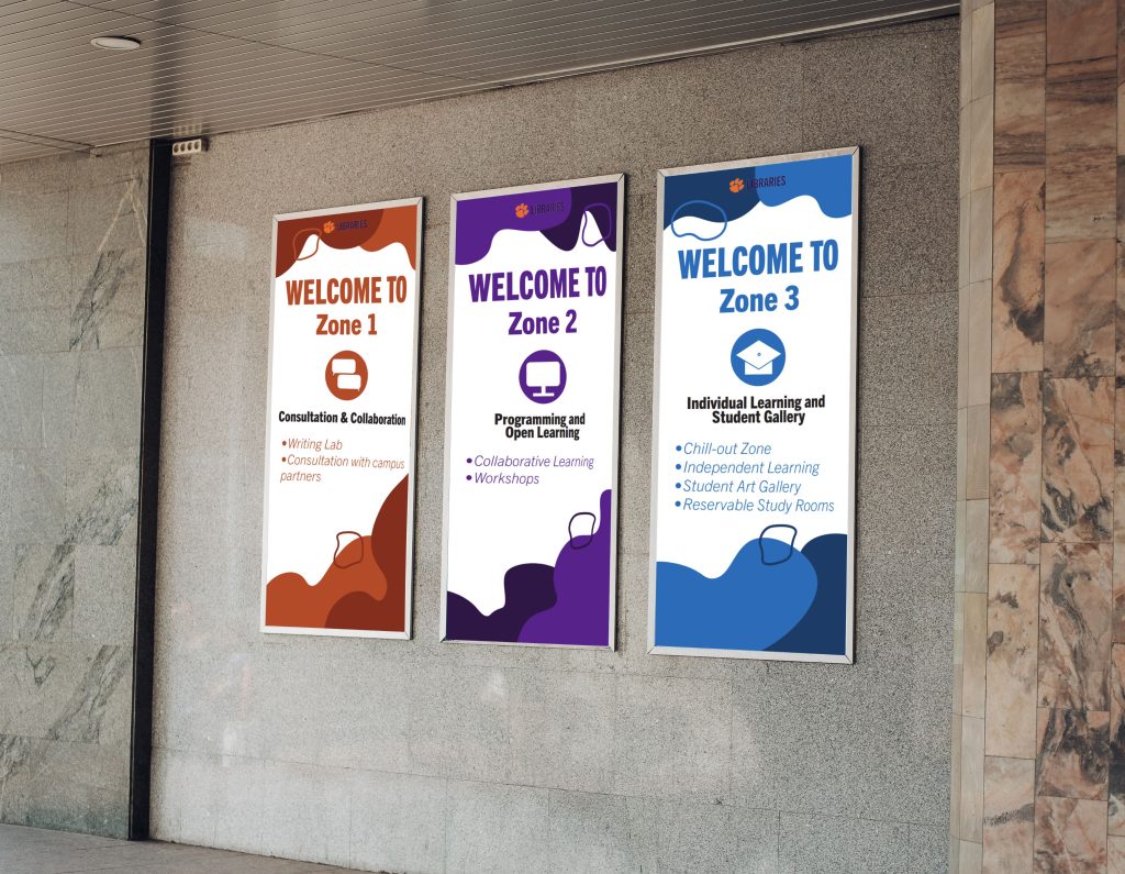

This is the design for the first banner, which featured orange and brick colors from the
Clemson branding palette. I also designed the
icon to reflect the consultation and collaboration purpose of the zone.

This is the design for the second banner, which featured shades of purple from the Clemson branding palette. I also designed the icon
to reflect the programming and open learning purpose of the zone.

This is the design for the third banner, which featured shades of blue from the Clemson
branding palette. I also designed the icon to
reflect the individual learning and student
gallery purpose of the zone.