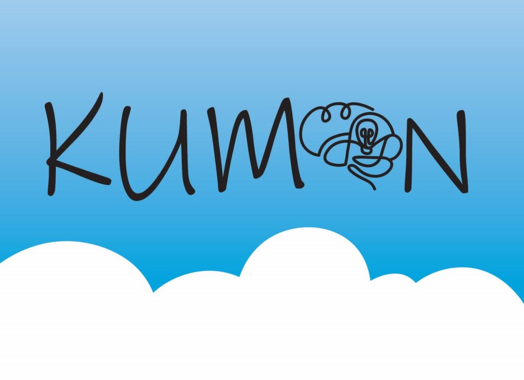
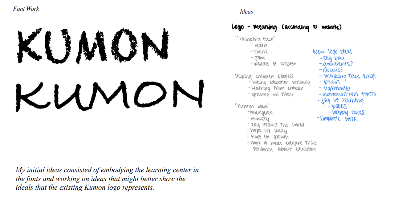
This is mock-client work consisting of a logo redesign for Kumon. Having spent 5 years as a student at Kumon, I never truly understood what the purpose of the original logo was, especially the “thinking face”. To counter the widely misinterpreted face, I chose to remove the image altogether and recreate a logo that reflects the values that the face is meant to represent.


Over the course of my research into Kumon’s mission and the meaning of every element in their logo, I learned that the blue symbolizes intelligence, the common sky around the world, and the hope for everyone to think seriously about education. The “thinking face” symbolizes learning and growth. Pulling from these important themes, I wanted to create a logo that centered around the student-centered nature of the organization and hope for worldwide education.

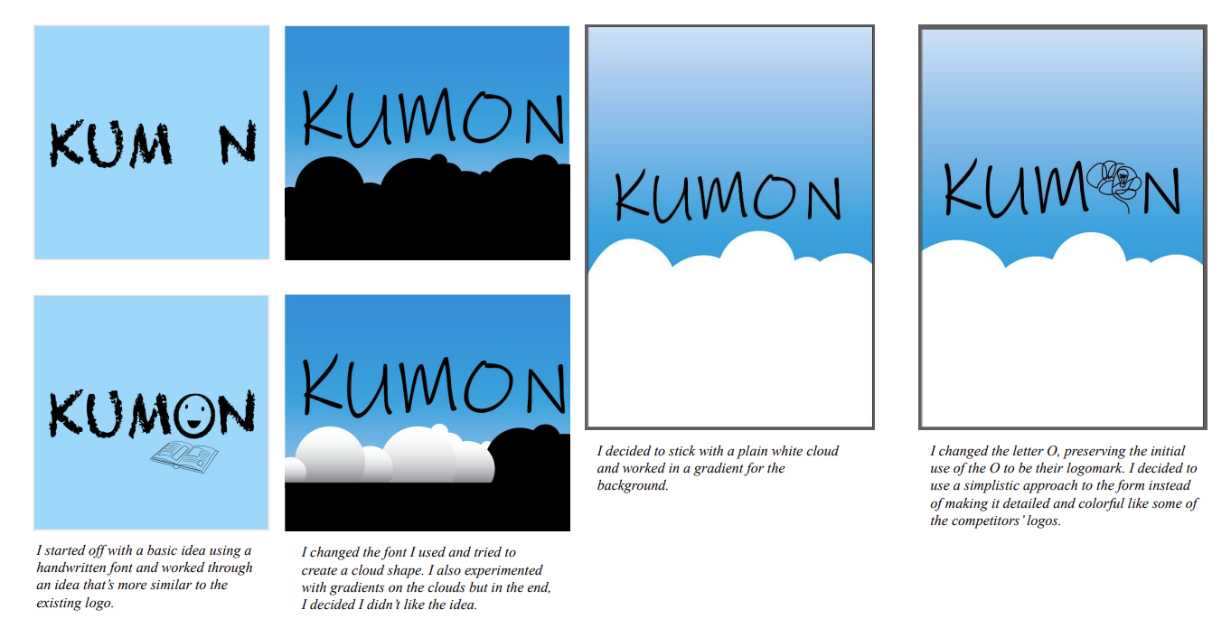
To emphasize the sky around the world, I changed the blue background to a gradient blue with white clouds. This brings the immediate correlation between blue and sky. I also chose to change the font to be similar to handwriting, which emphasizes the student/human-centered mission of Kumon. Lastly, I changed the “thinking face” to line art of a brain with a lightbulb, symbolizing thinking, learning, and educational growth.
Proudly powered by WordPress