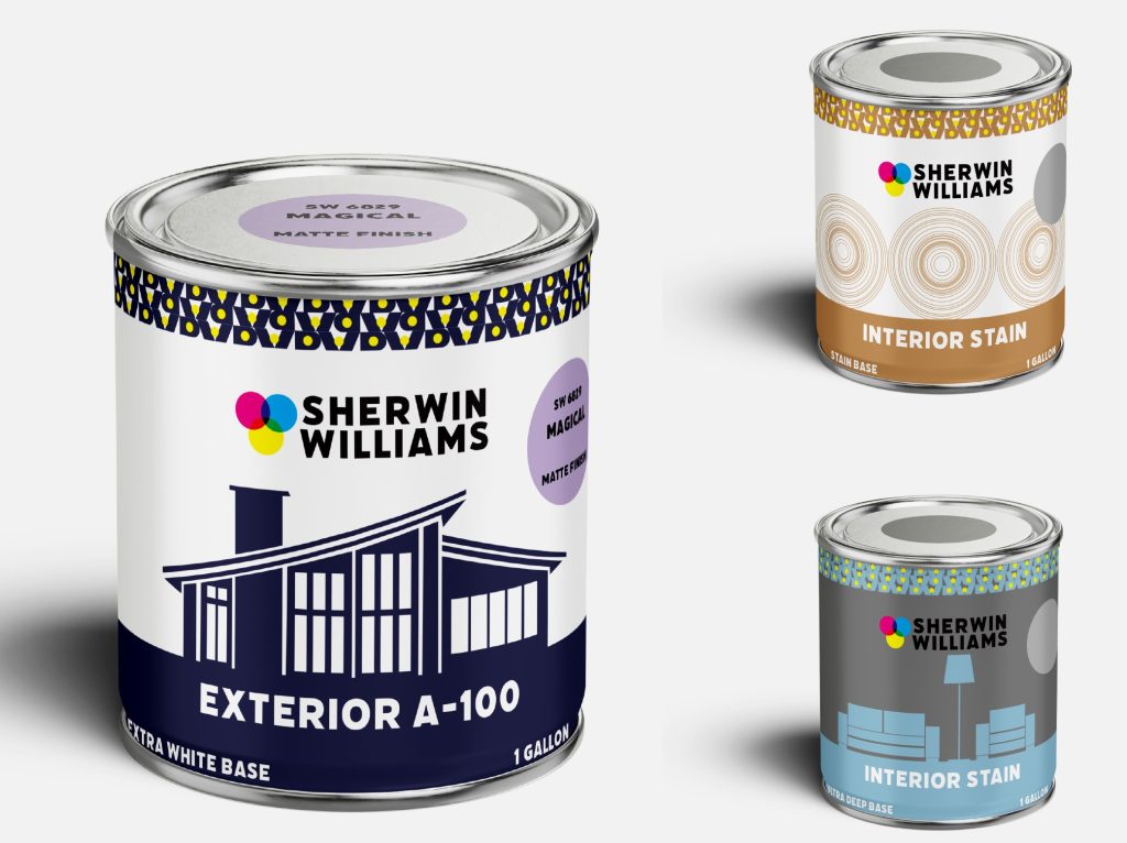
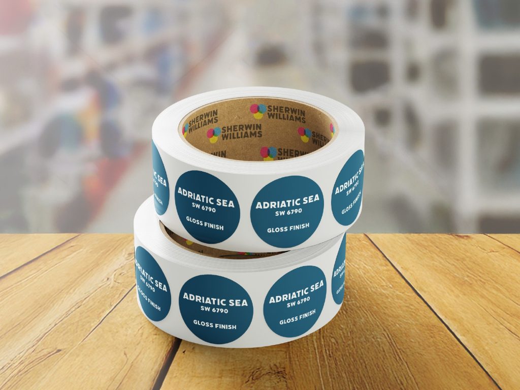
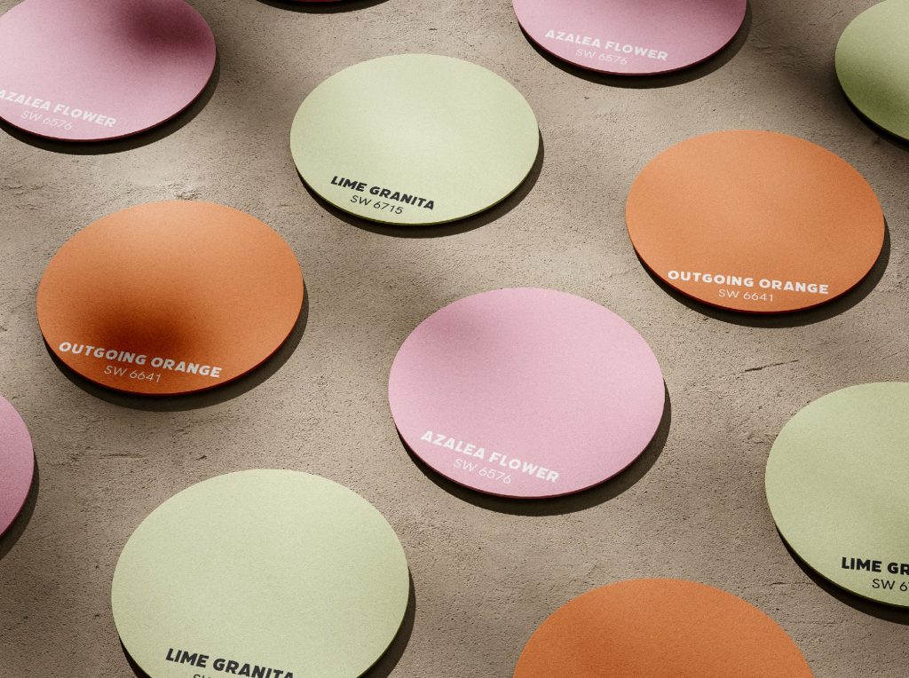
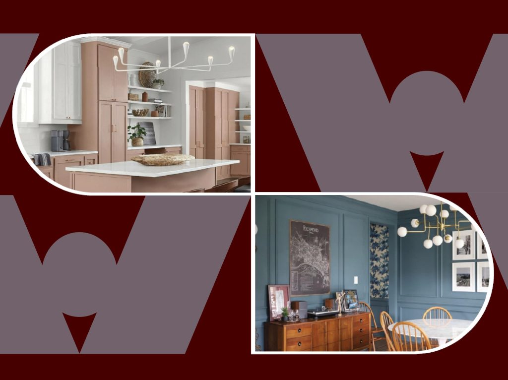
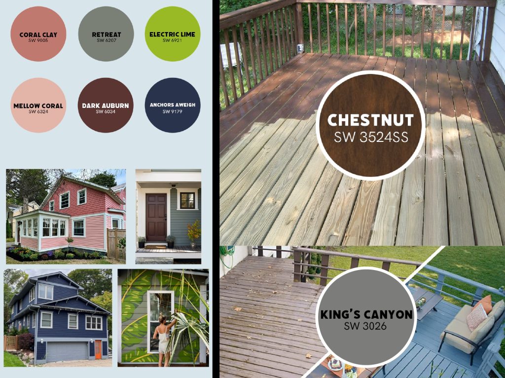
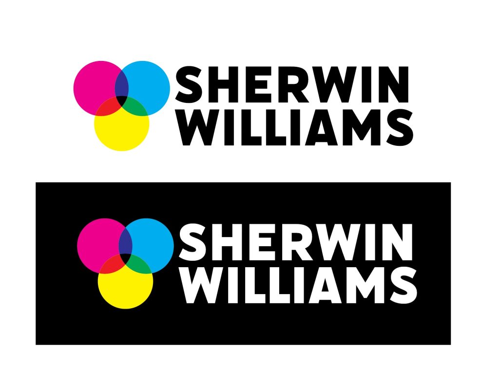
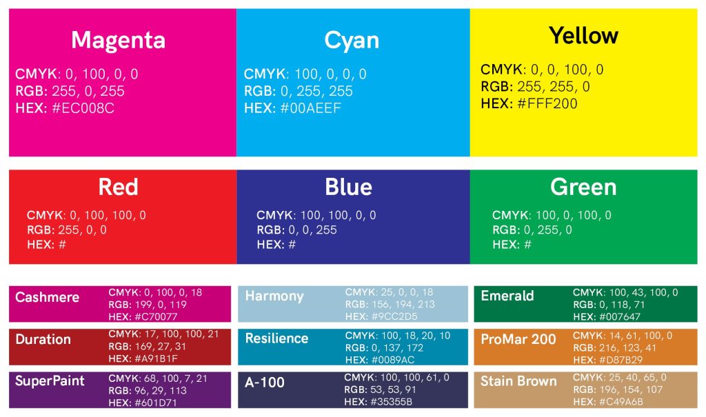
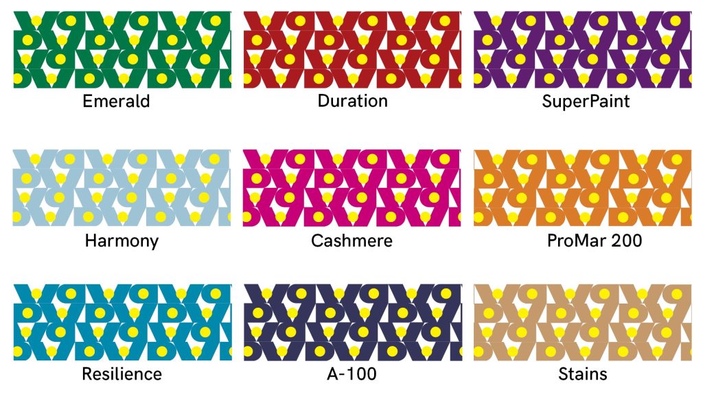
This project was a mock-client work, which consists of a rebrand of Sherwin Williams. In my own personal experience, the identification of a grade of paint, where it was to be used, and what the color was in a can were big pain points. To resolve this, I created a design that used visual and aesthetic elements to aid in clarity when one has stored paint cans in their home. This consists of icons, stickers, and a new paint can design. The current logo was also convtoversial to many people, so to pay homage to the company’s leading paint mixing system, I created a new logo to bring this feature to the front, especially because it is the reason that Sherwin Williams is at the top of the paint industry.
Proudly powered by WordPress